Most streamers fall into the trap of "feature creep." You start with a default layout, then add an alert box you saw on a friend’s channel, a custom sub-goal bar that clashes with your chat theme, and a donation badge that looks like it belongs on a different website. By the time you’ve "customized" everything, your channel page feels less like a brand and more like a cluttered bulletin board. The fundamental mistake here is forgetting that your stream branding isn't about how many assets you have; it’s about how quickly a first-time viewer understands what kind of experience they’ve just walked into.
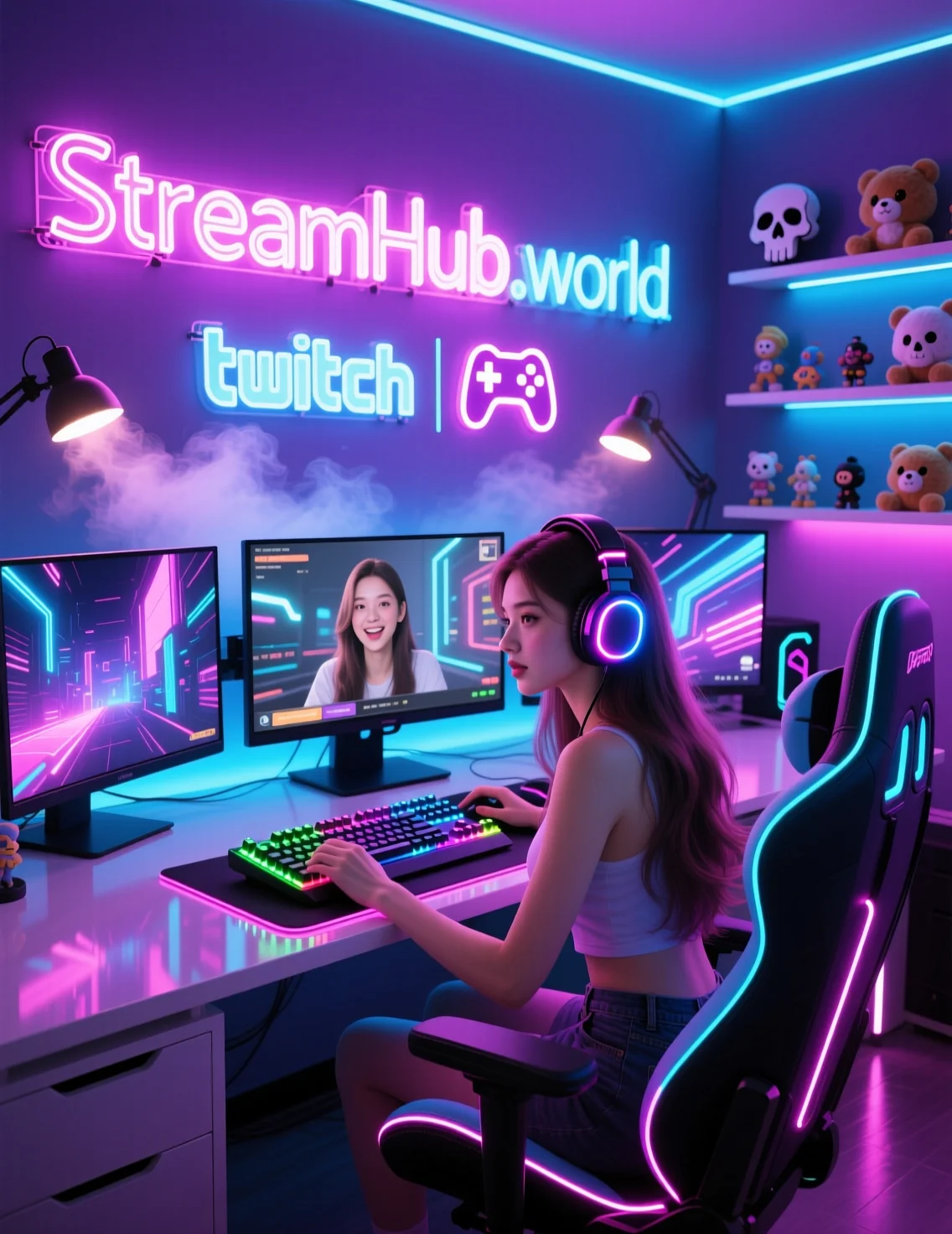
Your goal is to build a visual shorthand. When someone clicks your link from a social media post or a discovery feed, they should be able to identify your "vibe"—whether that's high-energy competitive play, cozy creative sessions, or chaotic variety—within three seconds of landing on your page.
{ }
}
The Core Framework: Defining Your Visual Identity
To avoid the clutter trap, start with a "three-color, two-font" rule. It sounds restrictive, but it forces you to prioritize consistency over flashiness. Pick one primary color for your major calls-to-action (like follow/subscribe buttons or alerts) and two secondary colors for background elements and text. If your branding assets—panels, offline screens, and webcam overlays—all pull from this specific palette, your channel will look professional regardless of how much money you spent on the graphics.
The Decision Framework:
- The Anchor Asset: Choose one element that dictates the tone. If you love a specific retro-gaming font, build your panels and alerts around that font's weight and style. Don't mix heavy bold headers with thin, handwritten body text.
- Negative Space: If your panels are too busy, the viewer won't read them. Strip your "About Me" and "Rules" panels down to the essential, actionable information.
- Mobile Reality: Most viewers check your panels on a phone. Keep your panel text short, left-aligned, and free of massive, multi-column images that break the scaling.
Practical Scenario: The "Cozy Gamer" Transition
Consider a creator named Alex who streams cozy simulation games. Alex initially used a high-contrast, aggressive red-and-black layout because they came from a background of competitive shooters. The audience felt a disconnect: the visual intensity of the stream page suggested high-stakes action, but the gameplay was relaxed and dialogue-heavy.
Alex fixed this by shifting the color palette to soft pastels (sage green, cream, and muted lavender). They swapped their sharp, angular alert animations for smooth, fading transitions. Within two weeks, they noticed that viewers were staying longer because the visual environment now matched the audio experience. This is the power of cohesion: when the visuals support the activity, the viewer doesn't have to work to reconcile what they are seeing with what they are hearing.
Community Pulse: The Recurring Friction
In creator spaces, a common point of frustration centers on the "over-design" fatigue. Many streamers express that they spent significant time and budget on animated overlays, only to realize their audience barely notices them once the gameplay starts. The consensus among creators who have been at this for years is that static, high-quality panels and a clean, readable font choice often outperform complex, motion-heavy overlays that obscure the game feed. There is a recurring pattern of streamers moving away from "busy" aesthetic trends toward "clean utility," finding that lower visual noise actually improves viewer retention.
Maintenance and Evolution
Branding is not a "set it and forget it" task. Your channel page needs a seasonal audit to ensure it stays relevant to the content you are currently producing.
- Quarterly Panel Audit: Check every link in your panels. Dead links to old social media or expired donation pages are the fastest way to look unmaintained.
- The "Stranger Test": Ask someone who has never seen your stream to open your channel page. Ask them to identify three things: what you play, when you usually stream, and where they can find you on social media. If they can’t answer these in ten seconds, your panel hierarchy is failing.
- Asset Cleanup: If you find a new graphic style, don't just layer it on top of your old one. Replace the old assets entirely to maintain that crucial sense of visual consistency.
If you find yourself needing to refresh your setup, you can check out resources like streamhub.shop for modular assets that prioritize functional, cohesive design over trendy gimmicks.
2026-05-22