Most streamers start their visual identity by picking a template pack. You see a set of "cyber-neon" overlays and think, "That looks professional." But six months in, you realize your gameplay style is relaxed and cozy, while your overlays look like an aggressive esports broadcast. You aren't just fighting to get viewers; you are fighting the visual noise of your own channel. Consistency isn't about having the best art; it is about ensuring your audience’s eyes aren't confused by a mismatch between your personality and your pixels.
{ }
}
Defining Your Visual "North Star"
Before you commission a designer or fire up an editor, you need to define your brand’s personality. If you can’t describe your stream in three adjectives, your assets will never feel cohesive. Are you high-energy and chaotic? Minimalist and educational? Nostalgic and retro?
A brand identity is built on three pillars:
- The Core Palette: Limit yourself to three colors. One dominant shade for your logo, a secondary for accents, and a neutral (usually dark gray or soft off-white) for text backgrounds.
- Typography: Don't use more than two fonts. One "hero" font for headers and your logo, and one highly legible sans-serif for chat overlays and information bars.
- Motion Cadence: This is where most streamers fail. If your transition stinger is a lightning-fast wipe but your sub alerts are slow, fading animations, the stream feels disjointed. Match the speed of your motion graphics to the energy of your content.
Scenario: From Chaos to Cohesion
Consider the case of a creator who shifted from "variety gaming" to "creative writing/world-building." Initially, they used a loud, angular logo with bright green neon accents. It worked for high-octane shooters, but it made their chill, introspective writing streams feel like a tech support center.
They didn't need to rebrand entirely. Instead, they kept the same logo shape but swapped the neon green for a muted, parchment-inspired cream. They replaced the aggressive, rapid-fire stinger with a soft, slow cross-fade. By changing only the "mood" of the existing assets, they aligned the visuals with the new content, resulting in a 15% increase in average watch time—likely because the visual tone finally matched the audio tone.
Community Pulse: The Recurring Friction
Across the creator ecosystem, a common frustration emerges when streamers try to update their branding. The consensus among those who have been live for years is that "over-designing" is a trap. The most common pitfall is the "clutter creep"—adding a new widget, a new graphic, or a new ticker every time a new trend appears. Creators often report that when they finally stripped away the unnecessary bells and whistles, their audience responded better to the cleaner, more intentional look. The pattern suggests that viewers prefer a stable, recognizable "home" over a stream that looks different every time they tune in.
The Brand Maintenance Checklist
Your brand is a living document, not a static file. Every three months, perform this audit to ensure your identity hasn't drifted:
- The Squint Test: Take a screenshot of your stream layout. Squint until the image is blurry. Does the most important part (the gameplay or the camera) still stand out, or do the overlays steal the focus?
- Color Consistency Check: Ensure the accent color in your alerts matches the accent color in your transition and your logo. If they aren't the same hex code, fix them.
- Legibility Audit: Check your chat and alert text on a mobile device. If it’s hard to read at a small scale, it’s failing your mobile audience.
- Asset Purge: Delete one overlay or widget you haven't used in the last 30 days. If you don't miss it, it was just visual clutter.
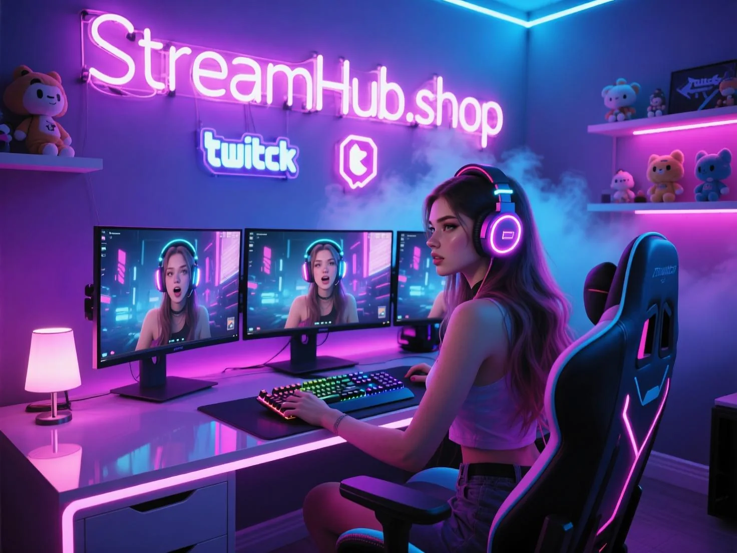
If you find that your design skills are the bottleneck, explore the tools available at streamhub.shop to find assets that prioritize clean, modular design over cluttered "gamer" tropes.
2026-06-13
Practical FAQ
How often should I change my logo?
Rarely. A logo is an anchor. Change your color palette or your font pairings if you want a refresh, but keep the core logo shape as long as possible to build long-term recognition.
Do I need custom art to look professional?
Not necessarily. Clean, well-spaced text and a consistent color scheme often look more professional than expensive, poorly-integrated custom illustrations that don't match your stream's vibe.