Most streamers start with a generic overlay kit they found in a marketplace. It works for the first month, but eventually, you realize your stream looks identical to fifty other channels. A brand identity isn't just a logo; it is the visual shorthand your viewers use to recognize your content before they even click on your thumbnail. If your color palette is chaotic and your logo is illegible at small sizes, you are losing the battle for recognition before the stream even begins.
The goal here is consistency. You want a viewer to see a specific shade of blue or a distinct typeface in a notification and instantly know it belongs to your channel.
{ }
}
The Decision Framework: Choosing Your Palette
Do not start by picking your "favorite colors." Start by defining the mood of your channel. A horror-focused stream requires a completely different visual language than a high-energy competitive shooter or a cozy creative craft session.
- The Primary Anchor: Choose one dominant color. This will be the backbone of your alerts, chat boxes, and banner accents. Keep it bold.
- The Secondary Support: Choose one color that provides high contrast to your anchor. If your anchor is a deep purple, a bright yellow or a clean white is your best friend for text readability.
- The Neutral Base: Never rely on pure black (#000000) or pure white (#FFFFFF). They are harsh on the eyes during long sessions. Use dark grays, navy blues, or off-whites to reduce eye strain for your viewers.
Practical Scenario: Imagine a streamer named Alex who plays tactical puzzle games. Alex chooses a "Deep Teal" as the primary brand color to signal calm intelligence. Instead of using generic black text on white backgrounds, Alex uses a "Slate Gray" for all chat text and "Cream" for high-priority notifications. This prevents the "flashbang" effect when a notification pops up, keeping the viewer comfortable for longer watch sessions.
Community Patterns and Common Pitfalls
Looking at current trends in the creator space, a recurring pattern is the move toward minimalism. Many creators who spent years building complex, high-motion animated overlays are now stripping them back. The feedback loop among veteran streamers suggests that "clutter fatigue" is real; when an overlay is too busy, it distracts from the gameplay or the host's personality.
Another common concern is "legibility creep." Creators often design logos that look fantastic on a 27-inch monitor but become a muddy blob when scaled down to a browser favicon or a mobile thumbnail. If your logo cannot be clearly identified when shrunk to the size of a postage stamp, it is too complex. Complexity does not equal quality; clarity does.
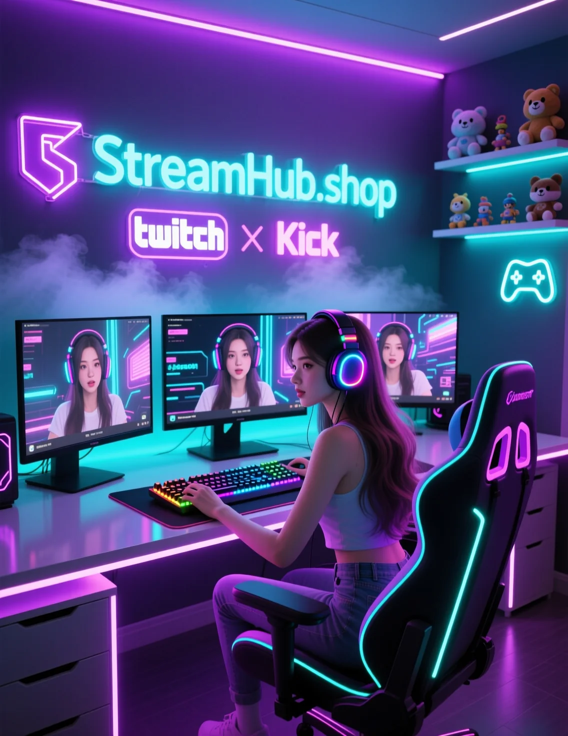
If you need resources or design assets to help structure these ideas, sites like streamhub.shop can provide templates that prioritize clean layouts over gaudy, over-engineered designs.
Maintenance: The Quarterly Visual Audit
Your brand is not set in stone. As your content evolves, your visuals should adapt. Set a reminder every three months to perform a visual audit of your channel. Ask yourself the following questions:
- Does my current color palette still accurately reflect the energy of the games I am playing today?
- Are there any design elements—like outdated social handles or old event graphics—that are cluttering the screen and no longer serve a purpose?
- If a new viewer jumped into the stream today, is my brand identity consistent across all touchpoints, or does the YouTube thumbnail look like it came from a different channel than the live stream?
If you find that your brand identity feels disjointed, do not be afraid to refine it. Small, iterative changes are better than a sudden, jarring rebrand that confuses your long-term audience. Keeping things clean and focused is always better than chasing the latest design trend.
2026-06-06
Quick Answers for Common Design Hurdles
Should I hire a designer or do it myself?
If you are just starting, do it yourself to learn what you actually like. Once you have a clear vision and a steady workflow, hiring a professional to polish your assets is a great investment for long-term growth.
Is it okay to use pre-made assets?
Yes, but always customize them. If you buy a pack, change the fonts and colors to match your brand. Using an asset "out of the box" is the fastest way to look like a generic channel.
How many colors are too many?
Stick to a three-color rule: one dominant, one secondary, and one neutral. Adding a fourth or fifth color usually leads to visual chaos.