The Art of Staying Recognizable: Beyond the Profile Picture
You have three seconds to hook a viewer who just landed on your channel page. If your overlay looks like it was designed in a different decade, your panels are mismatched, and your logo is a pixelated grab-bag of conflicting fonts, you aren't just looking unprofessional—you’re telling the audience that you don't take your own content seriously. A brand identity isn't about expensive graphic design; it’s about signaling to your viewers exactly what kind of experience they are in for.
Why Minimalism Beats Complexity
Most streamers fall into the trap of wanting their channel to be "everything." They want the logo to show off their favorite game, their personality, and their high-rank status all at once. This leads to visual clutter. The most effective brand identities in the current streaming landscape are defined by what they omit. If your logo looks like a messy esports team badge from 2018, it will get lost on a mobile screen. Your primary goal should be legibility at the size of a postage stamp. If you can’t recognize your avatar when it’s shrunk down to a 32x32 pixel icon, it’s time to simplify.
{ }
}
The Decision Framework for Your Assets
To avoid a mid-year rebrand, run every visual element through this three-step filter before you commit to it:
- The Color Rule: Pick two primary colors and one accent color. If you are adding a fourth, you are likely diluting your brand’s recognition. Stick to these hex codes for your overlays, alerts, and social media banners.
- The Font Audit: Limit yourself to two fonts. Use one bold, legible font for headers and alerts (where speed of reading matters) and a simpler, cleaner font for static panels or bio text. Anything more complex makes your channel look like a ransom note.
- The Context Check: Place your logo against a black background and a white background. If it loses detail on either, you need to create a secondary "inverted" version of your logo.
Practical Scenario: The "Rebrand Fatigue" Trap
Consider the creator who starts by playing nothing but horror games. They pick deep purples and jagged, aggressive fonts. Six months later, they find themselves loving cozy life-sims and chat-heavy variety content. Their brand now creates "cognitive dissonance"—the visual aesthetic promises a jump-scare, but the actual content is a calm conversation. The fix isn't to start over; it's to pivot the palette. By desaturating those aggressive purples into softer, muted tones and switching to a more rounded, readable typeface, they keep their existing recognition while signaling that the "vibe" of the channel has matured. Consistency isn't about being static; it's about being intentional.
Community Pulse: The Recurring Struggle
Across creator forums and Discord servers, a recurring pattern of frustration has emerged regarding "template culture." Many streamers feel trapped by the generic, pre-made overlay packs found on cheap marketplaces. While these provide a quick start, they often result in thousands of channels sharing the exact same aesthetic, which makes growth difficult. The community consensus is shifting toward "modular branding"—buying one high-quality, custom logo or emblem and then creating simple, bespoke overlays around it. The pain point isn't a lack of tools; it's the lack of individual identity in an ecosystem saturated with "gamer-style" templates.
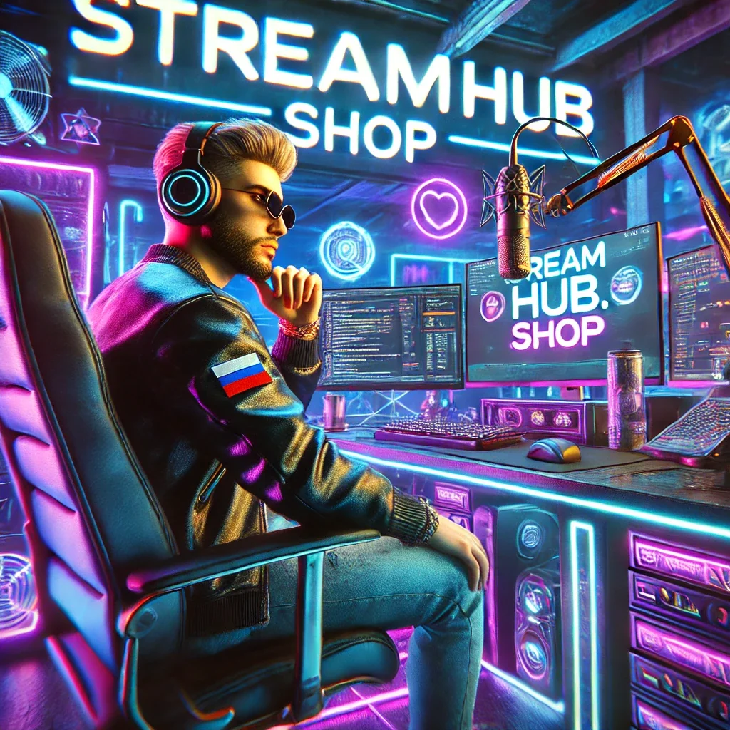
If you are looking for a starting point for your own custom assets, you might explore options at streamhub.shop, but ensure that whatever you choose, you can strip away the extra flair to keep your branding focused on your specific channel voice.
Maintaining Your Brand Over Time
A brand is not a "set it and forget it" project. Set a calendar reminder every six months to conduct a "Channel Audit." During this audit, look for these three things:
- Broken Assets: Are your stream panels still relevant? If you haven't played a game in six months, remove the panel. Clutter is the enemy of a premium feel.
- Consistency Drift: Check your Twitter, YouTube, and Twitch banners. Do they still use the same font and color palette? If you changed your stream overlay, make sure your social media updated to match.
- The "New Viewer" Test: Ask a friend who has never watched your stream to visit your page. Ask them what they think your "brand" is. If they describe it correctly, you are succeeding. If they are confused, your visuals aren't communicating clearly enough.
2026-05-20