You’ve seen it dozens of times: a new streamer pops up, their overlays are a mismatch of styles, their social media banner looks like it was made in five minutes, and their logo is a generic gaming icon. Then there’s the established creator whose visuals are so cohesive, you recognize their content instantly, no matter if you’re scrolling through Twitch, catching a YouTube short, or glancing at a Discord avatar.
The difference isn't always a massive budget or a professional design degree. Often, it's a deliberate, thoughtful approach to visual identity. A consistent brand isn't just about looking "pretty"; it's about recognition, trust, and signaling what your content is about before anyone even hears your voice. This guide will walk you through building that crucial visual foundation for your stream.
Beyond Aesthetics: Defining Your Core Vibe
Before you even think about hex codes or font choices, take a step back. What feeling, message, or experience do you want your stream to convey? This is your brand's core vibe, and it will inform every visual decision you make. Don't just pick colors you like; choose colors that *represent* your stream.
- What's your niche? Are you a cozy crafting stream, a high-octane FPS competitor, a deep-dive lore analyst, or a variety caster with a sarcastic edge?
- Who is your ideal viewer? What do they expect? What visual language would resonate with them?
- What three adjectives describe your stream? (e.g., "Energetic, Community-focused, Welcoming" or "Intense, Strategic, Competitive"). Keep these words visible as you design.
This clarity will be your compass. Without it, you're just throwing darts at a design board, hoping something sticks.
{ }
}
Crafting Your Visual Core: The Logo & Iconography
Your logo is the most concentrated representation of your brand. It needs to be versatile, recognizable, and scale well. Think beyond just one version; you'll likely need a primary logo and a simplified icon (often called a 'mark' or 'bug').
Your Logo: More Than Just a Name
- Simplicity is King: Complex logos become muddy when scaled down for an emote or profile picture. Aim for clear lines and minimal detail.
- Memorability: Can someone quickly sketch your logo after seeing it once? Unique shapes and clear typography help here.
- Relevance: Does it subtly (or overtly) hint at your content or personality? A controller for a gaming stream, a paintbrush for an art stream, etc.
- Versatility: Can it work in black and white? On light backgrounds and dark backgrounds? Horizontally and vertically?
The Icon/Sub-Mark: Your Brand's Shortcut
This is a simplified version of your logo, often just a single initial, a unique symbol, or a cropped element from your main logo. It's perfect for:
- Profile pictures (Twitch, YouTube, Discord, X)
- Emotes and badges
- Watermarks on video content
- Small corner branding on overlays
Ensure this icon is instantly identifiable and still carries the essence of your brand, even without the full name.
The Power of Color & Typography
Colors evoke emotion and communicate quickly. Typography sets a tone. Together, they are powerful tools for reinforcing your brand identity.
Building Your Color Palette
Start with 2-3 primary colors and 1-2 accent colors. Think about:
- Brand Vibe Match: Do the colors align with those adjectives you chose earlier?
- Bright, saturated colors often convey energy, playfulness.
- Muted, earthy tones suggest calm, professionalism, or nature.
- Cool blues and greens can feel trustworthy, serene, or techy.
- Warm reds and oranges often signify passion, excitement, or aggression.
- Contrast & Readability: Ensure your chosen colors work well together and provide enough contrast for text overlays and elements to be easily readable.
- Platform Compatibility: Consider how your colors will look on various platforms, especially against their default dark or light modes.
Choosing Your Fonts
Limit yourself to 1-2 fonts: one for primary headings/titles and another for body text or secondary information. Too many fonts create visual chaos.
- Readability is Paramount: Especially for overlays and chat alerts. Intricate, decorative fonts are rarely suitable for on-screen text viewers need to parse quickly.
- Reflect Your Vibe: A bold, blocky sans-serif might suit a high-energy stream. A clean, modern sans-serif or a slightly quirky hand-drawn font could fit a cozy creator.
- Licensing: Always check font licenses if you're using them for commercial purposes (like a Twitch stream). Google Fonts offers many free-to-use options.
Practical Scenario: "Gamer's Grove"
Let's imagine a streamer named Sarah who focuses on chill, narrative-driven indie games and building a friendly, supportive community. Her adjectives are "Cozy, Explorative, Welcoming."
- Logo: A stylized, clean illustration of a small, glowing tree or a leaf intertwined with a subtle controller outline. Simple, distinct.
- Icon: Just the glowing tree/leaf graphic.
- Colors:
- Primary: A calming forest green (
#346534) - Secondary: A warm, inviting cream or soft beige (
#F5F5DC) - Accent: A subtle, glowing amber (
#FFA07A) for interactive elements or highlights.
- Primary: A calming forest green (
- Fonts:
- Headings/Titles: A clean, slightly rounded sans-serif like 'Montserrat' or 'Inter' for a modern but friendly feel.
- Body/Overlay text: A highly readable, neutral sans-serif like 'Roboto' or 'Open Sans'.
Every element from her stream overlays to her Discord server theme, her social media posts, and even her merch will use these defined elements, creating a cohesive and instantly recognizable "Gamer's Grove" experience.
Community Pulse: The Branding Roadblocks
Many creators express a common set of anxieties when it comes to branding. One major concern is the fear of committing to a brand that might feel "wrong" later on, leading to endless tweaking or paralysis. There's often a struggle with translating their personality into visual elements, especially without a design background. Creators frequently mention feeling overwhelmed by the sheer number of choices – from specific shades of blue to the hundreds of available fonts – and wondering if their brand will look "amateurish" next to established creators. The perceived cost of professional design services is another recurring barrier, pushing many to DIY solutions which can sometimes lead to inconsistent results if not approached strategically.
Building Your Basic Brand Kit: A Step-by-Step
You don't need a fancy brand guide document to start. A simple folder on your computer and a text file will do.
- Define Your Core Vibe: Write down your niche, target audience, and 3 descriptive adjectives.
- Sketch Logo Ideas: Don't try to be an artist. Draw simple shapes, initial ideas. If hiring, this helps immensely. If DIY, pick a clear concept.
- Choose Your Fonts: Select 1-2 fonts that are readable and match your vibe. Note down their names.
- Curate Your Color Palette: Pick 2-3 primary colors and 1-2 accents. Use a color picker tool to get their hex codes (e.g.,
#RRGGBB). - Create/Source Your Logo & Icon: Get your logo designed (or design it yourself using tools like Canva, Adobe Express, or free vector editors) in various formats (PNG with transparent background, JPG, vector if possible). Ensure you have a clear icon version.
- Gather Supporting Visuals: Think about textures, patterns, or graphic elements that align with your brand (e.g., retro pixel art, abstract gradients, organic textures).
- Document Everything: Create a simple document (even a Google Doc or Notepad file) listing:
- Your brand adjectives.
- Your primary and secondary fonts (with links if applicable).
- Your full color palette (with hex codes).
- Links to your logo files and any other core assets.
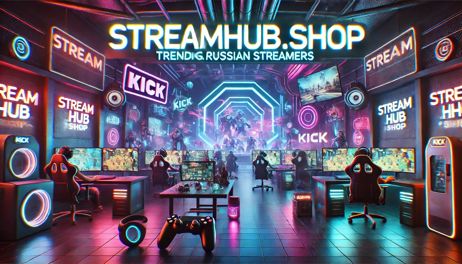
- Apply Consistently: Use these elements across your Twitch overlays, panels, alerts, YouTube channel art, Discord server, social media profiles, and any other visual touchpoints. Consistency is the goal. For custom overlays and assets that reflect your new brand, explore options at streamhub.shop.
What to Review & Refine Over Time
Your brand isn't set in stone forever. As your stream evolves, your visual identity might need to grow with it. Regular check-ins ensure your brand remains authentic and effective.
- Quarterly Alignment Check: Every few months, ask yourself: Does my current visual identity still accurately represent my content and my community? Has my niche shifted? Have my personal preferences changed?
- Viewer Feedback: Pay attention to subtle cues. Do new viewers quickly grasp what your stream is about from your visuals? Are your overlays easy to read? You don't need to redesign based on every comment, but recurring themes are worth noting.
- Platform Updates: Social media sites and streaming platforms occasionally update their layouts or introduce new features. Ensure your branding still looks good and is effective within these new contexts. Your profile picture might need a slight adjustment for a new circular crop, for example.
- Minor Tweaks vs. Rebrand: Not every misalignment requires a full rebrand. Sometimes, a slight color adjustment, a new secondary font, or an updated version of your icon is enough to refresh your look without losing established recognition. A full rebrand is a bigger undertaking, often reserved for significant shifts in content or audience.
2026-04-29