You have likely spent hours scrolling through overlay templates, caught in a loop of picking what looks "cool" versus what actually functions. The trap most creators fall into is treating brand identity as a purely visual choice—a matter of personal taste. But in the saturated ecosystem of modern streaming, your color palette is the first subconscious signal you send to a potential viewer before they even hear your voice.
Color psychology in streaming isn't about rigid rules or mystical associations; it is about cognitive load. If your overlays are a neon-saturated mess, you aren't just making it hard to read the chat; you are triggering sensory fatigue. If your colors clash with the tone of your gameplay, you create a subconscious disconnect that pushes viewers to click away. You aren't just designing a "look"—you are designing the viewer's emotional baseline for your stream.
{ }
}
The Functional Framework: Choosing Your Anchor Colors
To stop guessing, you need a hierarchy. A professional stream brand usually operates on a 60-30-10 rule: 60% neutral/background, 30% primary brand color, and 10% accent/alert color. If you try to give every element equal visual weight, you end up with a cluttered screen that feels claustrophobic.
Applying the 60-30-10 Rule
- The 60% (Base/Neutral): These are your dark grays, off-whites, or desaturated tones. This is the canvas for your gameplay. If this color is too loud, the viewer’s eye will constantly fight to find the action.
- The 30% (Brand/Primary): This is your identity. It should be consistent across your stream labels, lower thirds, and social media banners. This is the color that viewers should eventually associate with your name.
- The 10% (Alert/Accent): This is your high-contrast "call to action." Use this sparingly for follower alerts, sub goals, or critical UI elements. It needs to be distinct enough to grab attention but limited enough that it doesn't become visual noise.
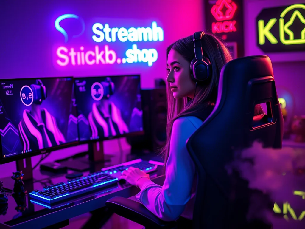
If you are struggling to find a balance, streamhub.shop offers curated overlay kits designed with this specific hierarchy in mind, which can serve as a solid baseline if you aren't ready to build from scratch.
Mini-Case: The "High-Octane" vs. "Cozy" Pivot
Consider a streamer who plays fast-paced shooters like *Apex Legends* or *Valorant*. They might gravitate toward "energetic" colors like neon orange or electric lime. This works because the color intensity matches the adrenaline of the gameplay. However, if that same streamer pivots to a long-form story game or a chill "just chatting" session, those same neon overlays create a jarring psychological clash. The viewer's brain expects intensity, but the content is providing relaxation. The solution isn't necessarily changing the whole brand, but having a "dimmed" version of your overlays—shifting from high-contrast neon to a muted, lower-opacity version—to keep the brand identity while adjusting the mood for the content.
Community Pulse: The Recurring Friction
Across various creator forums and feedback channels, a few patterns consistently emerge regarding branding. Creators frequently express frustration that their "perfect" logo and color scheme looks great on a 4K monitor but turns into an illegible smear on a mobile device. Another common pain point is the "alert fatigue" phenomenon, where streamers realize their alert colors are so similar to their UI colors that followers don't even notice when a new sub comes in. The consensus among experienced creators is shifting away from "what looks artistic" toward "what provides the most legibility." The community is increasingly rewarding creators who prioritize low-cognitive-load designs over complex, multi-colored graphic overlays.
Maintenance: When to Audit Your Look
Your brand identity is not a static object. It should undergo a formal review at least every six months. During this audit, ask yourself these three questions:
- Does the palette survive a color-blindness check? Use a free online simulator to see if your high-contrast elements disappear for viewers with color vision deficiencies.
- Is the "Alert/Accent" color still distinct? As you add more widgets and plugins, it is easy to let your primary brand color bleed into your alert notifications. If you can’t tell the difference at a glance, simplify your palette.
- Does the color palette match your current content flow? If you have shifted from high-energy gaming to analytical tutorials, your aggressive red-and-black theme might actually be undermining your authority. Don't be afraid to desaturate or adjust your core colors to match your current production value.
2026-05-23