You've launched your Kick channel, you're streaming regularly, and you're building a community. But as you scroll through other channels, you start to feel it: a sense of sameness. Your profile picture, banner, and in-stream graphics might be functional, but do they truly represent your unique vibe? Are they helping you stand out, or are you just another face in the crowd?
Making your Kick channel visually distinctive isn't just about looking "pretty." It's about crafting an identity, signaling your content niche, and creating a memorable experience that keeps viewers coming back. It's an investment in your brand, telling potential viewers who you are before you even say a word.
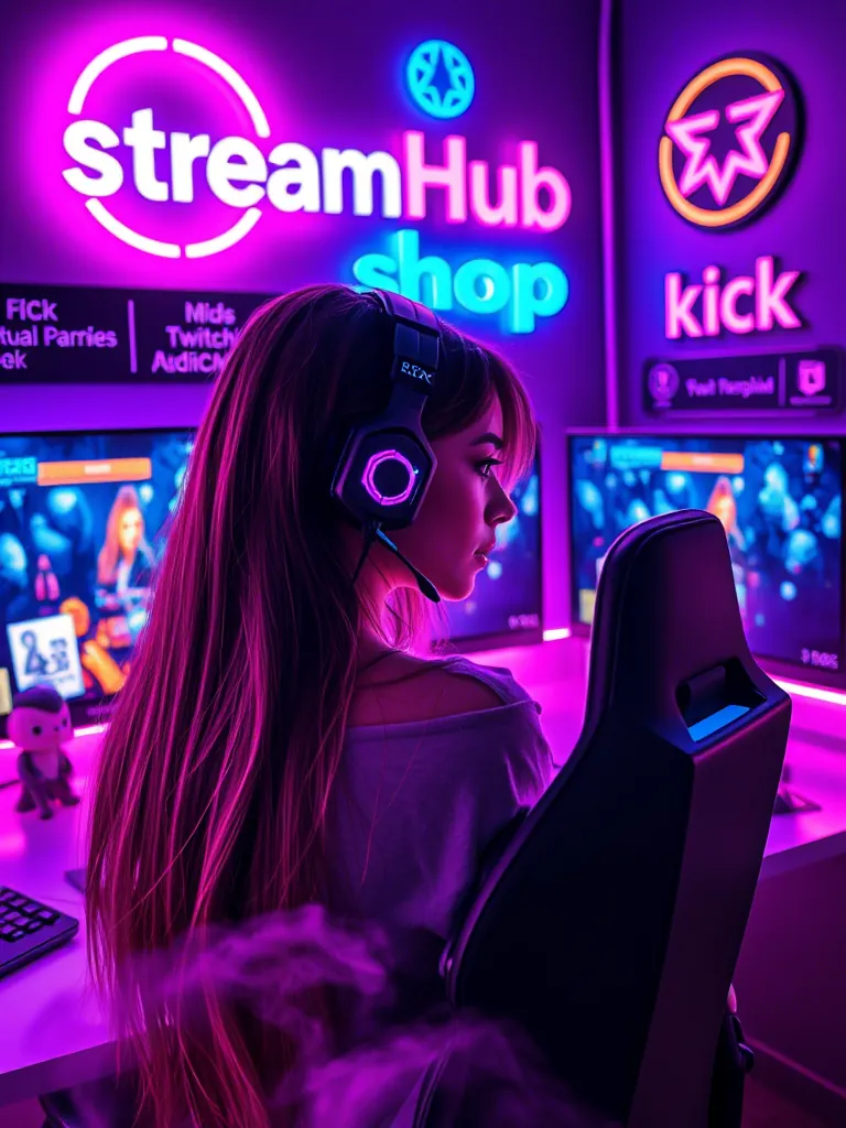
Your Channel Page: The Digital Front Door
Think of your Kick channel page as your storefront. It's the very first impression a new viewer gets, often before they even click into your live stream. Every element here is an opportunity to communicate your brand, your content, and your personality.
- Profile Picture (Avatar): This is your primary identifier across the platform. It should be high-resolution, easily recognizable even at a small size, and reflective of your brand. A clear headshot, a unique logo, or an icon that ties into your content are all strong choices. Avoid busy backgrounds or text that's unreadable when scaled down.
- Channel Banner: This is prime real estate to showcase your creativity and provide key information. Use it to reinforce your brand colors, introduce your content style (e.g., specific game genres, creative themes), and perhaps include your stream schedule or social media handles. Ensure the design is visually appealing and legible on various screen sizes.
- Offline Screen: Don't overlook this crucial visual. When you're not live, your offline screen can still engage visitors. Use it to display your schedule, tease upcoming content, link to your social media, or simply reinforce your brand with an attractive graphic. It's a missed opportunity if it's just a blank screen or a default image.
- Custom Panels: Below your stream, panels are where you provide details about yourself, your rules, your gear, and how people can support you. While the text is important, the visual design of these panels is key. Consistent headers, icons, and background images that match your overall brand aesthetic elevate the professionalism and readability of this section. Imagine clean, custom-designed headers for "About Me," "Schedule," or "Socials" instead of plain text.
The goal here is consistency. Each element should feel like it belongs to the same visual family, reinforcing your brand identity rather than presenting a disjointed experience.
{ }
}
In-Stream Visuals: Crafting the Viewer Experience
Once a viewer clicks into your stream, the visual journey continues. Your in-stream graphics are what they'll spend the most time looking at. These aren't just decorative; they serve functional purposes and contribute heavily to the overall professionalism and entertainment value of your broadcast.
- Stream Overlays: These are the graphical layers that sit on top of your gameplay or webcam feed.
- Webcam Border: A custom border around your webcam can instantly brand your presence.
- Game Overlay: Clean, non-intrusive overlays that display chat, recent events, or follower goals can enhance the viewing experience without blocking crucial gameplay.
- Intermission/Be Right Back (BRB) Screens: Use these screens for short breaks. They're excellent opportunities to display custom art, engaging animations, or even countdown timers for your return.
- Starting Soon Screens: Build anticipation before you go live. Include music, social media links, and a clear message that the stream will begin shortly.
- Custom Alerts: The sounds and visuals that pop up when someone follows, subscribes, donates, or raids your channel are critical. Move beyond default alerts. Design custom animations, unique sound effects, and personalized messages that reflect your channel's personality. A well-designed alert can turn a simple interaction into a memorable moment.
- Scene Transitions (Stingers): Instead of abrupt cuts between scenes (e.g., from game to BRB), consider using stinger transitions. These are short, animated video clips that provide a smooth, branded transition. They add a polished, broadcast-quality feel to your stream.
The key here is integrating these elements seamlessly. They should enhance, not detract from, your primary content. Think about how they guide the viewer's eye and maintain visual interest throughout your stream.
Color, Typography, and Theme: Your Visual Language
These are the foundational elements that tie all your visual customizations together. They form your "visual language" and communicate your channel's identity at a glance.
- Color Palette: Choose 2-4 primary and accent colors that resonate with your content and personality. Are you high-energy and vibrant? Perhaps bright neons or bold primaries. Are you calm and focused? Muted tones or pastels might fit better. Consistency in your color use across all your assets (profile, banner, overlays, alerts) creates a cohesive and recognizable brand.
- Typography (Fonts): Select 1-2 fonts for your channel that are legible and align with your theme. One for headlines/prominence and one for body text. A retro-gaming channel might use pixelated fonts, while a chill-vibes streamer might opt for a smooth, handwritten style. Avoid using too many different fonts, as this can make your channel look messy and unprofessional.
- Overall Theme/Aesthetic: This is the overarching style that dictates all your design choices. Do you have a cyberpunk theme? A cozy cottagecore vibe? A minimalist aesthetic? A strong theme provides a guiding star for every visual decision, from your logo to your webcam border. It ensures every piece of your visual identity contributes to a unified and powerful message.
Investing time in defining these core elements early on will save you a lot of redesign work later and ensure your channel's visuals are always pulling in the same direction.
Community Pulse: Common Visual Hurdles
Many streamers grapple with similar challenges when trying to make their Kick channels visually stand out. A common sentiment revolves around the desire for a professional look without having a background in graphic design or a large budget.
Creators frequently express concern about their stream appearing cluttered or overwhelming. They worry that too many animated elements or an overly busy overlay might distract viewers from the actual content. Another recurring point is the struggle to differentiate visually in highly saturated niches, where many channels employ similar aesthetics.
To address these concerns, many successful streamers emphasize starting simple. They suggest leveraging pre-made overlay packages (often available for free or at low cost) and then customizing them incrementally. They also advocate for thoughtful use of negative space and prioritizing clear information over excessive decoration. For standing out, the advice often points to leaning into a specific, unique aspect of the creator's personality or content, even within a popular niche, and then translating that uniqueness into a distinct visual theme.
Scenario: Retro Arcade Revival
Meet "PixelPioneer," a streamer who focuses exclusively on classic arcade games and retro console titles from the 80s and 90s. PixelPioneer wants their Kick channel to instantly evoke nostalgia and a passion for gaming history.
- Profile Picture: A pixel-art rendition of a classic arcade cabinet joystick and buttons, with a bold, 8-bit style font for their name.
- Channel Banner: A dynamic collage of iconic pixelated game sprites from various eras, laid out against a dark, neon-accented background. It includes a small section for their "Stream Schedule" in a retro-futuristic font.
- Offline Screen: A static image of an old CRT monitor displaying a "Game Over" screen, but with "PixelPioneer will be back!" replacing the game text. Below it, their social media handles are listed in a classic arcade font.
- In-Stream Overlays: A minimalist overlay featuring a subtle pixelated border around the webcam, with a small score display and a custom "Top Score" follower goal in the corner, all rendered in an 8-bit style.
- Alerts: Custom alerts that mimic classic arcade sound effects (e.g., "new follower" sounds like collecting a coin, "new sub" like a level-up jingle) paired with short pixel art animations (e.g., a tiny character sprite dancing).
- Color Palette: Dominant colors are deep purples, neon blues, and vibrant reds, reminiscent of arcade cabinet lighting and classic game palettes.
- Typography: Primarily uses a clean, readable pixel font for all on-screen text and a more rounded, futuristic sans-serif for larger headers.
By making these deliberate visual choices, PixelPioneer's channel immediately communicates its niche and passion, creating an immersive and nostalgic experience for viewers even before the gameplay begins.
Kick Channel Visual Audit Checklist
Use this checklist to evaluate your current Kick channel's visual impact, or to plan new customizations:
- Profile Picture: Is it clear, recognizable, and on-brand at small sizes?
- Channel Banner: Does it accurately represent your content and theme? Is text legible on various devices?
- Panels: Are custom headers used? Do they match your overall aesthetic? Is the information clear and easy to read?
- Offline Screen: Is it engaging? Does it provide useful information (schedule, socials)?
- Starting Soon Screen: Does it build anticipation? Is your branding clear?
- BRB/Intermission Screens: Are they visually consistent? Do they provide a clear "return soon" message?
- Webcam Border: Does it enhance or distract? Is it on-brand?
- Game Overlay: Is it clean, non-intrusive, and readable? Does it avoid blocking important game elements?
- Alerts: Are they unique, on-brand, and not overly long or loud?
- Scene Transitions: Are they smooth and branded (if using stingers)?
- Color Palette: Is it consistent across all elements? Does it convey the right mood?
- Typography: Are your chosen fonts legible and consistent? Do they fit your theme?
- Overall Consistency: Does every visual element feel like it belongs to the same unique brand?
- Clutter Check: Is there enough negative space? Does anything feel visually overwhelming?
What to Re-Check Over Time
Your channel's visual identity isn't a one-and-done project. It evolves as you do. Periodically, it's wise to review and update your visuals:
- Brand Evolution: As your content matures or your personal brand shifts, your visuals should reflect that. A complete rebrand can be exciting, but even minor tweaks can keep things fresh.
- Seasonal/Event Updates: Themed overlays or alerts for holidays, special events, or charity streams can add a fun, timely touch and show your engagement.
- Platform Changes: Kick, like any platform, might introduce new features or change layout specifications. Ensure your existing assets still look good and function correctly.
- Performance Issues: Overly complex animated overlays or high-resolution graphics can sometimes impact stream performance. Periodically check if your visuals are causing any lag or dropped frames.
- Community Feedback: Pay attention to comments or suggestions from your viewers. They might notice something that's unclear or express appreciation for a specific visual element.
- Software Updates: Streaming software (like OBS Studio or Streamlabs Desktop) often updates, offering new ways to implement visual effects or improve performance. Stay informed.
Keeping your visuals current and effective is a continuous process that ensures your Kick channel always presents its best, most unique self to your audience.
2026-04-15