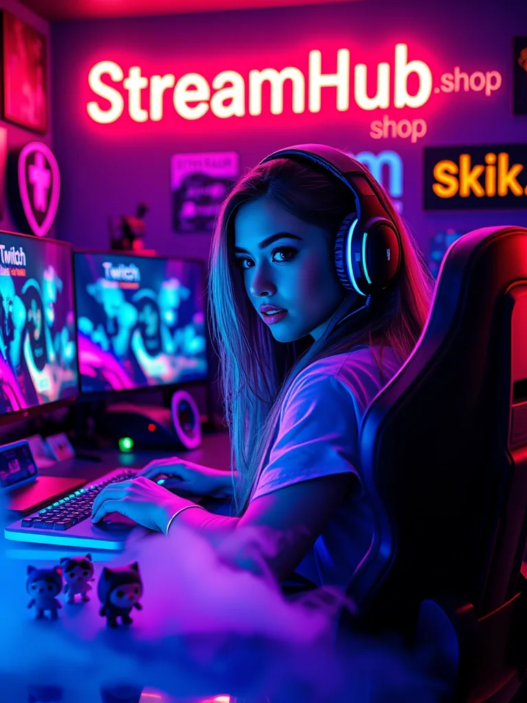
You've poured hours into your content, honed your commentary, and built a community. But sometimes, when you look at your channel, it feels... generic. You know your personality shines through your stream, yet your visual identity might be a patchwork of assets, a cool logo here, some trendy emotes there, but nothing quite speaking the same language. This isn't just about aesthetics; it's about recognition, professionalism, and making a lasting impression in a crowded space. A strong, cohesive visual brand ties everything together, telling your story before you even say a word.
Beyond the Logo: Defining Your Core Aesthetic
Before you even think about hiring an artist or picking out fonts, you need to articulate the essence of your brand. Your logo, emotes, and overall visual identity aren't just pretty pictures; they're direct translations of your content, your personality, and the experience you offer viewers. This foundational step is often rushed, leading to assets that look good individually but fail to connect as a whole.
What's Your Vibe? Keywords & Mood Boards
Start by brainstorming descriptive keywords. Are you:
- Energetic, chaotic, high-action?
- Calm, cozy, chill, educational?
- Retro, futuristic, whimsical, gritty?
- Funny, serious, edgy, family-friendly?
Create a digital mood board (Pinterest, Miro, even a simple folder of images) that captures this feeling. Include colors, fonts, textures, photography styles, even fashion or interior design elements that resonate with your chosen keywords. This isn't about copying; it's about collecting inspiration to define your unique flavor. This board will be your guiding star for all future design decisions.
Your Brand's Color Story
Colors evoke emotion and memory. Choose a primary color (your main brand color), a secondary color (to complement or provide contrast), and an accent color (for highlights, calls to action). These three to five colors should define your entire visual presence. Test them together. Do they feel right for your vibe? Are they distinct enough from other streamers in your niche?
Translating Vision to Assets: Logos & Emotes that Connect
Once you have a clear aesthetic defined, you can start creating the core visual components that will represent your brand everywhere.
The Streamer Logo: More Than Just an Icon
Your logo is the bedrock of your visual identity. It needs to be:
- Memorable: Simple enough to recall quickly.
- Scalable: Looks good whether it's a tiny profile picture, a stream overlay element, or a banner. Complex details often get lost when sized down.
- Versatile: Works in different contexts (light backgrounds, dark backgrounds, with text, without text).
- Representative: Reflects your core aesthetic and content type.
Think beyond just a cool graphic. Does it tell a piece of your story? Does it hint at your niche? Is it unique enough to stand out?
Emotes: Your Brand's Micro-Expressions
Emotes are tiny, powerful brand ambassadors. They should:
- Reflect your personality: Use your brand's style, colors, and sense of humor.
- Be instantly recognizable: Even at 28x28 pixels, viewers should understand the emotion or reference. Avoid excessive detail.
- Maintain visual consistency: They should look like they belong to the same family as your logo and other stream assets. Same character style, line weight, and color palette.
- Cater to your community: Incorporate inside jokes, recurring stream moments, or common reactions specific to your audience.
Mini-Scenario: The "Galactic Gatherer" Brand
Let's say a streamer named Alex focuses on exploration games, sci-fi adventures, and community co-op. Their keywords are "discovery," "friendship," "futuristic," "cozy," and "exploration." Their mood board features nebulae, retro-futuristic art, warm blues and purples, and gentle glowing elements.
Logo Development: Alex commissions a logo featuring a stylized astronaut helmet peering out at a star-filled void, with a subtle, friendly, almost hand-drawn feel. The helmet's visor reflects a tiny, friendly companion bot. The primary color is a deep indigo, secondary is a warm lavender, with an accent of a soft, glowing aqua.
Emote Development: Their emotes extend this. "GGWave" is a pixelated version of the companion bot waving. "GGSpaceHeart" shows the bot holding a heart-shaped nebula. "GGHyped" is the bot doing a cosmic celebratory dance. All emotes use the defined color palette and maintain the clean, friendly sci-fi aesthetic, ensuring they are readable even at small sizes.
This approach ensures every visual piece contributes to the overarching "Galactic Gatherer" narrative, making Alex's channel instantly recognizable and memorable.
The Cohesion Challenge: Making It All Work Together
Having great individual assets is a start, but true branding power comes from consistency across all your touchpoints. Your visual identity needs to be harmonized across:
- Stream Overlays: Starting Soon, BRB, gameplay frames, webcam borders.
- Channel Panels & Banners: On Twitch, YouTube, Kick.
- Alerts: Follows, subs, raids, donations.
- Social Media: Profile pictures, header images, post templates.
- Offline Screen: What viewers see when you're not live.
- Discord Server: Icons, banners, role colors.
- Merchandise (if applicable): T-shirts, mugs, stickers.
Everywhere your audience encounters you visually, your brand should be present and consistent. Use the same fonts, the same color palette, and a consistent graphical style. Inconsistency, even minor, can make your channel feel less professional and dilute your memorability.
Community Pulse: Common Traps & Fixes
In our discussions with creators, several recurring visual branding pain points emerge. It's easy to fall into these traps, but awareness helps you sidestep them.
-
"Analysis Paralysis": Many streamers get stuck in the initial planning phase, overwhelmed by choices or fear of making the "wrong" decision. They spend weeks or months brainstorming without committing.
- Fix: Set a deadline for your initial aesthetic definition. It doesn't have to be perfect; it just needs to be *a* direction. You can always refine later. Sometimes, just starting with "good enough" is better than waiting for "perfect."
-
"Trend Chasing": Adopting popular visual styles (e.g., specific neon aesthetics, popular character art styles) that don't genuinely align with their unique content or personality. While it might look current, it often lacks authenticity and distinction.
- Fix: Revisit your core keywords and mood board. Does the trend genuinely fit your *specific* brand, or are you just admiring the aesthetic? Prioritize uniqueness and authenticity over fleeting popularity.
-
"Inconsistent Application": Creators might invest in a great logo and emotes but then use mismatched fonts on panels, different color schemes on social media banners, or generic alert animations.
- Fix: Develop a simple "brand guide" for yourself. This can be a one-page document or even a text file listing your exact hex codes, primary fonts, and general style notes. Refer to it every time you create a new asset or update an old one.
-
"Forgetting Scalability/Readability": Designing assets that look fantastic on a large monitor but become an unreadable blur when shrunk down for a profile picture or a tiny emote.
- Fix: Always test your designs at their smallest intended sizes. Ask for feedback: "Can you tell what this is at 28x28 pixels?" Simplify details where necessary for clarity.
Your Brand is Alive: When to Review & Refresh
A strong brand isn't static; it evolves with you. Your content changes, your audience grows, and your personal style matures. Periodically reviewing your visual identity ensures it remains relevant and effective.
When to Consider a Review or Refresh:
- Significant Content Shift: You've moved from primarily gaming to educational content, or from casual chats to intense competitive play.
- Audience Evolution: Your community has grown and developed its own unique inside jokes or preferences that aren't reflected in your current brand.
- Feeling Stale: Your current aesthetic simply doesn't excite you anymore, or it feels outdated compared to current design trends.
- Technical Limitations: Your original assets might be low resolution, making them difficult to scale for new platforms or merchandise.
- Personal Growth: You've simply grown as a creator and your brand needs to catch up to your current persona.
Is Your Visual Identity Cohesive and Current? A Checklist:
- Does my logo still accurately represent my content and personality?
- Are my emotes instantly recognizable and legible at their smallest sizes?
- Are my chosen colors, fonts, and graphical styles consistent across ALL my platforms (Twitch, YouTube, X, Discord, website)?
- Do my overlays, panels, and alerts all feel like they belong to the same brand?
- Does my brand feel fresh and modern, or is it showing its age?
- Does my visual identity differentiate me from other streamers in my niche?
- Have I considered how my brand would look on potential merchandise?
If you find yourself answering "no" to several of these, it might be time for a review. A full rebrand is a big step that requires careful planning to avoid confusing your audience. Often, a "refresh" – updating elements while retaining core recognition – is a more manageable and effective approach.
2026-03-30