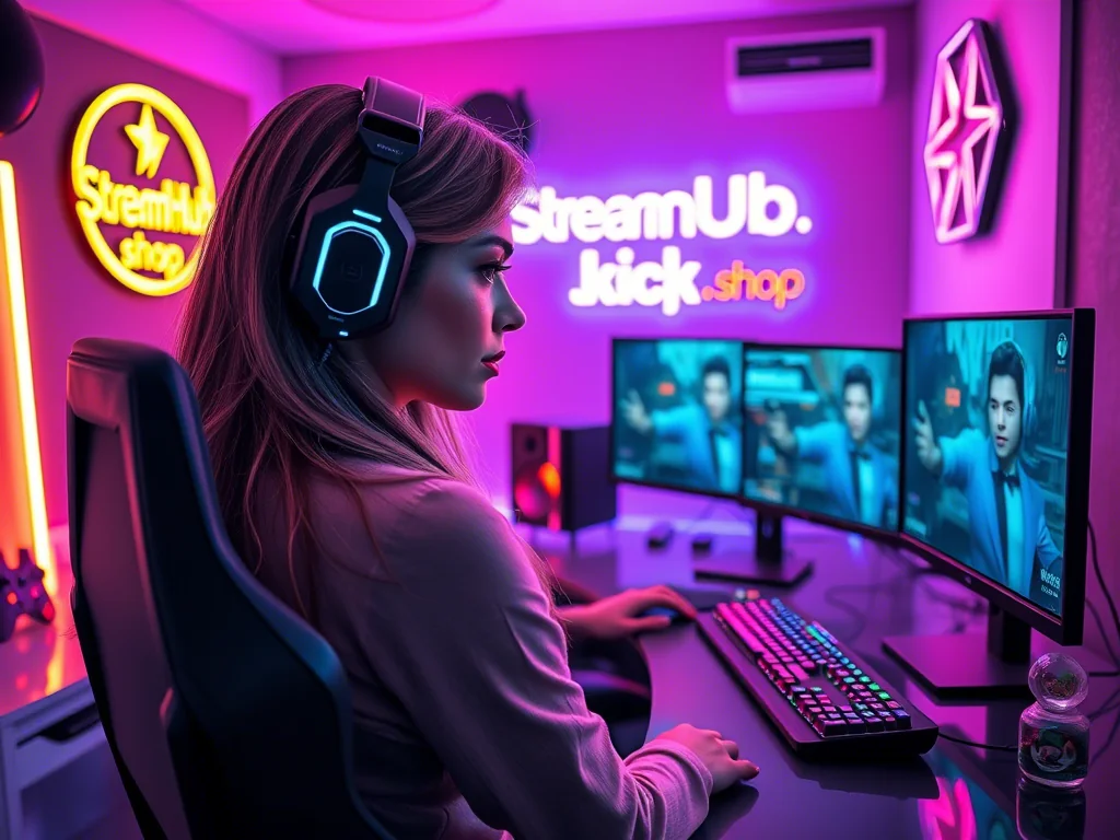
You’ve got your mic, your camera, your game, and your community. But when someone new lands on your channel, what do they see? Do they instantly get a feel for your vibe, your content, your personality? Or does it all look a bit... generic? Building a recognizable brand isn't just about picking a cool font; it's about crafting an identity that sticks, speaks to your audience, and sets you apart in a crowded digital space.
This guide isn't about hiring an agency or becoming a design expert overnight. It's about making deliberate choices for your core visual elements—your logo and color palette—so they serve a purpose beyond just looking good. Let's dig into how you can build a visual language that genuinely represents you and your stream.
Beyond Just "Pretty": Your Brand's Purpose
Before you even think about shapes or shades, consider what your stream’s brand needs to do for you. A strong brand isn't just decoration; it's a powerful communication tool. It helps you:
- Stand Out: In a sea of streamers, unique visuals grab attention.
- Communicate Your Niche: Colors, styles, and symbols can instantly hint at your content—are you chill, chaotic, educational, or competitive?
- Build Trust & Recognition: Consistent branding makes you look professional and memorable, fostering loyalty. People recognize you across platforms.
- Attract Your Ideal Audience: Your visual identity can act as a beacon, drawing in viewers who resonate with your aesthetic and message.
Think of your brand as the visual shorthand for everything you are as a creator. What feeling, energy, or message do you want to convey within seconds?
{ }
}
Your Core Visuals: Logo & Color Palette – Making Intentional Choices
These two elements are the bedrock of your visual identity. Don't just pick what you like; pick what works hard for your brand.
The Logo: Your Stream's Signature
Your logo is your primary identifier, appearing on everything from overlays to social media banners. A good stream logo is:
- Simple: Overly complex designs get lost, especially at small sizes. Think iconic, not intricate.
- Memorable: Can someone recall it after seeing it once? Does it have a unique element?
- Versatile: It needs to look good as a small avatar, a large banner graphic, on a light background, and on a dark one. Can it work in black and white?
- Relevant: Does it subtly hint at your content or personality? A horror streamer might use a different style than a cozy game streamer.
Decision Framework for Your Logo:
- What's the core essence of your stream? (e.g., "fast-paced FPS," "relaxing creative," "community-focused chat").
- What imagery or symbols might represent that essence? (e.g., a controller for gaming, a paintbrush for art, a microphone for podcast-style streams).
- How can this be simplified? Remove extraneous details. Can it be a recognizable shape, an initial, or a minimal icon?
- Test its scalability: Does it look good as a 50x50px avatar? How about a full-screen transition?
- Consider readability: If text is part of it, is it clear?
The Color Palette: Setting the Mood
Colors evoke emotion and create atmosphere. Your chosen palette should complement your logo and reinforce your stream's overall tone.
- Primary Colors (2-3): These are your dominant colors. They'll be used most frequently in overlays, banners, and primary text.
- Accent Color (1): A contrasting color used sparingly for highlights, calls to action, or key information. It should pop without clashing.
- Neutral Colors (1-2): Whites, grays, or subtle off-blacks for backgrounds, secondary text, or to give the eye a rest.
Tips for Choosing Colors:
- Color Psychology: Research what different colors generally represent (e.g., blue for trust/calm, red for energy/passion, green for nature/growth). Align these with your stream's vibe.
- Harmony: Use a color wheel to find complementary, analogous, or triadic schemes. Tools exist online to help you build harmonious palettes.
- Contrast & Accessibility: Ensure sufficient contrast between text and background colors, especially for viewers with visual impairments. Check your main colors against your accent color.
- Platform Consistency: Consider how your colors will look across different platforms (Twitch, YouTube, Discord, Twitter).
Consistency is Key: What This Looks Like in Practice
Once you have your logo and color palette, the real work is applying them consistently everywhere. This isn't about being rigid, but about being recognizable.
Case Study: "Aura's Oasis"
Let's say a streamer named Aura focuses on cozy, relaxing gameplay like Stardew Valley, Animal Crossing, and wholesome chat. Her goal is to create a calming, inviting space.
- Logo: Aura opts for a simple, stylized leaf icon intertwined with a subtle "A." It's clean, organic, and works well at various sizes.
- Color Palette:
- Primary: Soft forest green (#4CAF50), muted sky blue (#87CEEB)
- Accent: A gentle golden yellow (#FFD700) for subtle highlights.
- Neutrals: Creamy off-white (#F8F8F8) and a light taupe (#D2B48C).
- Application:
- Overlays: Her webcam border is a soft green, chat boxes use the cream background with taupe text.
- Channel Art: Banners feature the leaf logo prominently, using the sky blue and green with a touch of golden yellow.
- Social Media: Her profile pictures are the leaf logo. Posts use her color palette for backgrounds or text accents.
- Alerts: Subtle animations use the golden yellow for emphasis, complementing the gentle chimes.
- Merch (future): Simple designs featuring the leaf logo and primary colors.
The result? Viewers instantly understand Aura's stream is about calm and nature. The consistent visuals reinforce her content and create a cohesive, inviting atmosphere that her target audience appreciates.
Community Pulse: Navigating the Branding Maze
Creators often express a few common stumbling blocks when it comes to branding:
- Analysis Paralysis: Many get overwhelmed by choices, endlessly tweaking a logo or cycling through color palettes without committing. The fear of "getting it wrong" can stop progress.
- Fear of Commitment: There's a concern that once a brand is chosen, it's set in stone forever. This leads to indecision, or conversely, frequent, jarring changes that confuse viewers.
- Budget Constraints: Some feel a professional, high-quality brand is out of reach without significant financial investment in designers.
- "Looking Unprofessional": New streamers worry their DIY efforts won't stack up against established creators, leading to discouragement.
The key takeaway from these patterns is to start somewhere. A simple, thoughtfully chosen brand is always better than no brand, or a constantly shifting one. You don't need a massive budget; clear intentions and consistency go a very long way.
Your Brand Isn't Static: When to Review & Refine
Your stream, like you, will evolve. Your content might shift, your audience might grow in a new direction, or your personal style could change. Your brand should be flexible enough to grow with you, but not so fluid that it loses all recognition.
What to Re-check Annually (or as needed):
- Brand Alignment: Does your current logo and color palette still accurately represent your content, personality, and target audience? If you've pivoted from horror games to cozy cooking streams, your spooky red and black theme might need a refresh.
- Visual Fatigue: Are you, or your audience, tired of the current look? A minor refresh (e.g., tweaking an accent color, simplifying a logo element) can feel fresh without a full rebrand.
- Technical Performance: Are your assets still high-resolution? Do they look crisp on new platforms or devices? Are your colors still accessible?
- Competitive Landscape: Has your niche changed visually? Are you blending in too much with new trends, or looking outdated compared to new creators? This isn't about chasing trends, but being aware.
A "rebrand" doesn't always mean a total overhaul. Often, it's a "refresh"—a subtle update to keep things current and aligned with your evolving creator journey. Communicate any significant changes to your community; they're invested in your identity too!
2026-04-02