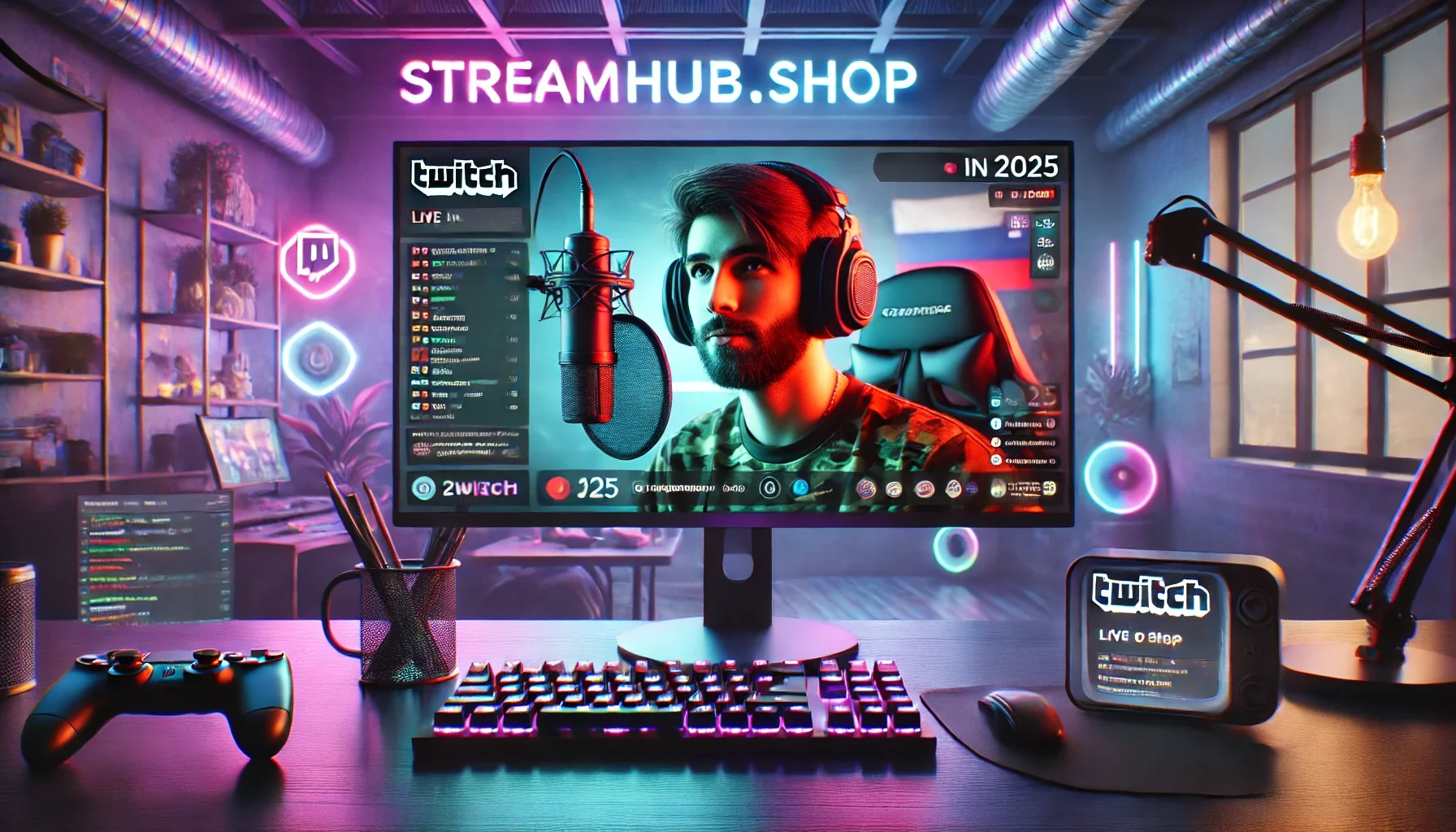
You’ve poured hours into refining your content, building a community, and honing your stream persona. But when viewers land on your channel, does your visual presentation immediately reinforce who you are and what you offer? For many creators, the answer is a hesitant "maybe." Generic, default, or mismatched overlays can subtly undermine the hard work you've put in elsewhere, leaving your channel feeling less professional, less distinct, and ultimately, less memorable.
This isn't about chasing the latest trend or having the flashiest animations. It's about leveraging your stream overlays as a powerful, consistent branding tool. Think of them as your channel's digital storefront, an immediate visual cue that communicates your identity before you even say a word. Done right, custom overlays don't just look good; they elevate your entire presence and help forge a stronger connection with your audience.
Beyond Pretty Pictures: Your Overlay as a Brand Statement
At its core, a stream overlay is a collection of graphical elements that sit on top of your gameplay or camera feed. But "custom" means more than just slapping on a free template. It means infusing your unique identity into every border, every pop-up, and every transition. This isn't just about aesthetics; it's about strategic communication.
- First Impressions: Your overlay is often the first thing new viewers see. A well-designed, branded overlay instantly conveys professionalism and hints at your content style (e.g., chill, high-energy, educational).
- Memory & Recognition: Consistent use of colors, fonts, and graphical motifs makes your channel instantly recognizable. This builds brand equity, helping viewers recall your content even when they're not actively watching.
- Atmosphere & Immersion: Overlays contribute heavily to the overall mood of your stream. A cozy, warm overlay for a comfort gamer, or a sleek, futuristic one for a tech reviewer, helps immerse viewers in the intended experience.
- Trust & Cohesion: When all your visual elements – from your Twitch banner to your alerts – speak the same language, it signals attention to detail and a cohesive vision. This builds trust and makes your channel feel like a well-oiled machine.
 }
}
The Anatomy of a Branded Overlay: What Really Matters
Let's break down the key components and how to ensure they're working hard for your brand, not just filling space.
-
Webcam Frame: Your Digital Portrait
- Branding Focus: This small window is often the most personal part of your stream. The frame should complement your channel's color palette and design language without overwhelming your face. Is your brand minimalist? A thin, subtle border. Is it bold and edgy? Something with sharp angles or a textured finish.
- What to Avoid: Overly thick frames that eat into your webcam feed, clashing colors, or busy patterns that distract from you.
-
Alerts: The Celebratory Micro-Moments
- Branding Focus: Follows, subscriptions, donations – these are key engagement points. Your alerts should be an extension of your brand's personality. Do they pop up with a playful animation and a custom sound? Or are they sleek and understated? The font, color, and animation style here are crucial.
- What to Avoid: Generic alert sounds or visuals that don't match your channel's vibe. Overly long animations that block gameplay or get irritating quickly.
-
Chat Box: The Community Hub
- Branding Focus: While primarily functional, the chat box can still be branded. Consider the font for chat messages (ensure readability!), the background transparency, and any subtle borders or corner details. Your brand colors can be used here too.
- What to Avoid: Illegible fonts, backgrounds that make text hard to read, or colors that clash with the rest of your overlay.
-
Scene Transitions: The Polished Chapter Breaks
- Branding Focus: These are the short, impactful animations that play when you switch between scenes (e.g., starting soon, gameplay, be right back). A custom "stinger" transition is a fantastic branding opportunity. It should be short, smooth, and incorporate your logo, colors, or a signature animation.
- What to Avoid: Jarring, overly long, or default transitions. Anything that feels out of place with your channel's overall visual language.
-
Top/Bottom Bars & Information Panels: Your Dynamic Billboard
- Branding Focus: These sections are prime real estate for displaying recent followers, top donors, social media handles, or rotating messages. Use consistent fonts and colors. Ensure the layout is clean and easy to scan.
- What to Avoid: Cluttering these areas with too much text or too many conflicting elements. Information that's outdated or irrelevant.
Practical Scenario: "The Retro Arcade Enthusiast"
Let's imagine a streamer, 'PixelPat,' whose brand is all about celebrating classic arcade games and the golden era of gaming. His persona is enthusiastic, nostalgic, and a bit quirky.
- Color Palette: Think 8-bit pastels, vibrant neons, and dark, pixelated backgrounds. Muted purples, greens, and blues with pops of bright pink or yellow.
- Font Choices: Pixelated fonts for titles and alerts, but a clean, easy-to-read sans-serif for chat and main information.
- Webcam Frame: A simple, slightly-pixelated border in a complementary pastel color, perhaps with tiny, subtle "scanlines" effect to evoke old CRT monitors.
- Alerts: When a new follower joins, a small, animated 8-bit coin-collecting sprite could appear, followed by the username in a pixel font, accompanied by a classic arcade "ding!" sound effect. Subs might trigger a mini-animation of a high-score screen.
- Scene Transitions: A custom stinger that "wipes" across the screen with a classic arcade 'level complete' animation, revealing the next scene.
- Information Panels: A bottom bar with his social media handles, rendered in a clean font but within a pixel-art style container.
In this scenario, every visual element, from the smallest alert to the scene transitions, consistently reinforces PixelPat's "Retro Arcade Enthusiast" brand, making his stream instantly recognizable and immersive for his target audience.
Community Pulse: Overcoming Common Overlay Hurdles
Across creator forums and discussions, a few recurring themes emerge when streamers talk about their overlays:
- "It feels too busy." Many creators struggle with trying to fit too much information or too many animated elements onto the screen. The result is a cluttered, distracting experience. The fix? Prioritize. What absolutely needs to be on screen? What can be relegated to an info panel or a quick alert? Often, less is more, allowing your content and personality to shine.
- "It doesn't match my vibe." Sometimes streamers pick elements they like individually, but they don't coalesce into a cohesive whole. This often comes from mixing different aesthetic styles or color palettes. The solution lies in defining your brand's core identity first, then ensuring every graphic choice aligns with that central theme.
- "It's hard to read or see." Readability is paramount. Small fonts, low-contrast colors, or elements that block crucial parts of the game are common complaints. Always test your overlay on different screen sizes and resolutions. Ensure fonts are legible, and transparency settings allow background game elements to be seen without making text disappear.
- "I don't know where to start." The sheer volume of options can be paralyzing. Many advise breaking it down: start with a simple color palette, then design your webcam frame, then alerts. Build it piece by piece, testing as you go. Resources like streamhub.shop offer curated packs that ensure consistency from the outset, which can be a great starting point for those who aren't graphic designers.
Setting Up for Success: Your Overlay Design Checklist
Before you even open your design software, run through these steps:
- Define Your Brand's Essence:
- What's your niche? (e.g., competitive FPS, cozy simulation, educational tech reviews)
- What's your personality? (e.g., energetic, calm, witty, serious)
- What feelings do you want to evoke? (e.g., excitement, relaxation, curiosity)
- Choose Your Core Visuals:
- Color Palette: Select 2-3 primary colors and 1-2 accent colors that reflect your brand. Use online tools for inspiration.
- Font Pairings: Pick a primary font for titles/logos and a secondary, highly readable font for smaller text and chat.
- Logo/Iconography: Do you have a distinct logo or an icon that represents your channel? This should be a recurring motif.
- Sketch & Plan Layouts:
- Before digital design, roughly sketch where elements like your webcam, chat, and information panels will sit on your screen. Consider different scenes (e.g., gameplay, AFK, talking head).
- Prioritize screen real estate for your main content (gameplay/you).
- Source High-Quality Assets:
- Whether you're hiring a designer, buying a pre-made pack, or creating your own, ensure all graphics are high-resolution and fit your chosen style.
- For animations, ensure they are smooth and optimized for streaming software.
- Implement & Test Thoroughly:
- Load your overlays into OBS, Streamlabs Desktop, or whatever software you use.
- Do test streams. Check readability on different devices (mobile, large monitors).
- Ensure alerts trigger correctly and animations play smoothly without performance drops.
- Solicit feedback from trusted friends or community members.
Evolving Your Visuals: What to Review Over Time
Your brand isn't static, and neither should your overlays be. Periodically, step back and evaluate whether your current visuals are still serving your channel effectively.
- Six-Month Check-Up: Every six months or so, take a critical look. Does your overlay still feel fresh? Has your content or persona shifted in a way that your visuals no longer align?
- Performance Review: Are your overlays impacting stream performance? High-resolution animations or too many complex elements can sometimes tax your system. Look for opportunities to optimize without sacrificing quality.
- Readability & Functionality Audit: Have you added new information panels or elements? Ensure everything remains readable and doesn't clutter the screen. Are your alerts still triggering reliably and at appropriate volumes?
- Community Feedback: Pay attention to subtle cues from your audience. Are they struggling to read something? Do they mention elements that feel dated? While you shouldn't overhaul based on every single comment, consistent feedback is valuable.
- New Features & Opportunities: Streaming platforms and software are constantly evolving. New overlay features or integration options might open up creative branding opportunities you didn't have before. Stay informed.
Maintaining a strong visual brand takes ongoing effort, but the payoff in viewer recognition, professionalism, and community connection is well worth the investment.
2026-03-07