On Kick, visibility is everything. Even if your content is strong, you still need something that convinces people to click. That “something” is your thumbnail — a tiny visual asset that plays a massive role in whether your stream gets discovered, recommended, or scrolled past.
In 2025, good thumbnails are no longer optional. Kick is growing fast, the number of creators is rising, and the algorithm favors streams with strong CTR (click-through rate). If your thumbnail grabs attention, you’re already ahead.
Below is a complete guide to designing Kick thumbnails that pull viewers in, support раскрутка канала на Кике, and increase your chances of landing in recommendations — all while keeping your branding consistent and professional.
H2: Why Kick Thumbnails Matter More Than You Think
Kick’s discovery system is relatively simple:
If users click your stream more often than the average streamer in your category, the algorithm tests you to a larger audience.
That means your thumbnail directly affects:
-
CTR (click-through rate)
-
Placement in “Recommended for You”
-
Ranking within your game/category
-
Viewer retention during the first minutes
It also indirectly helps when you’re trying to Boost Kick Viewers or stabilize visibility during low-traffic hours. When more people click, the algorithm sees positive signals and expands your reach — even if your baseline comes from external tools.
H2: Step 1 — Use a Clear, Focused Main Subject
The biggest mistake new streamers make is trying to include too much in a single thumbnail.
Stick to one main focal point:
-
Your face/reaction
-
A specific moment from gameplay
-
A bold text hook
-
A recognizable character or item
The fewer competing elements you have, the easier it is for users to understand the theme in half a second — which is exactly how long you have when people scroll.
Pro Tip:
Zoom in more than you think you need.
Close-ups always outperform wide shots, especially on mobile.
H2: Step 2 — Use Color Contrast to Stand Out
Kick’s UI is mostly dark and saturated, so your thumbnails should:
-
Use bright key colors (yellow, neon green, cyan, pink)
-
Apply high contrast between subject and background
-
Add outlining or glow around your face/object
-
Slightly raise exposure and sharpness
This visually separates your thumbnail from the platform’s overall palette.
Avoid:
Flat lighting, gray tones, low-contrast backgrounds — they blend into the feed and kill CTR.
H2: Step 3 — Add Text (but Keep It Short)
Most of the time, you only need 2–4 words.
Examples that work well:
-
“Insane Win”
-
“New Meta”
-
“Hardest Challenge”
-
“Ranked Grind”
-
“Chat Went Wild”
Design rules:
-
Use big, bold fonts
-
Avoid more than two font styles
-
Add outlines or shadows
-
Don’t place text on top of a busy area
Remember:
If your text isn’t readable on a phone, delete it.
H2: Step 4 — Show Emotion (It Performs Every Time)
On all streaming platforms — Kick, Twitch, YouTube — thumbnails with expressive faces outperform neutral ones.
Emotions that work best:
-
Shock
-
Rage
-
Excitement
-
Laughing
-
Extreme focus
Even if you’re a gameplay-focused streamer, your face sells the story. Human expressions create instant connection and curiosity.
H2: Step 5 — Keep Branding Consistent Across All Thumbnails
This helps users recognize your content instantly.
Branding elements you can standardize:
-
Border color
-
Font style
-
Background blur or vignette
-
Placement of your face
-
Logo (small, unobtrusive)
-
A signature color palette
A recognizable thumbnail style increases your trustworthiness — and trust is critical when you’re trying to grow your average viewers and Boost Kick Viewers naturally.
H2: Step 6 — Create Templates to Save Time
Consistency is key, but doing everything manually slows you down.
Use templates for:
-
Color correction
-
Placement of elements
-
Text positions
-
Reaction shots
-
Gameplay frames
This dramatically speeds up workflow and keeps your branding sharp.
Tools like Photoshop, Figma, Canva, and Photopea all work fine.
H2: Step 7 — Test Multiple Variants (A/B Testing for Streamers)
Even one small change — different facial expression, color scheme, or text — can increase CTR by 10–40%.
To test thumbnail performance:
-
Change thumbnails every few streams
-
Track CTR and new followers
-
Analyze which combinations work best
-
Save top performers as your “default style”
Kick doesn’t have built-in A/B testing, but analytics still reveal what pulls better.
H2: Step 8 — Integrate Thumbnails into Your Growth Strategy
A good thumbnail doesn’t just attract clicks — it supports the entire ecosystem of your promotion.
When combined with:
-
social media traffic,
-
consistent streaming schedule,
-
recognizable branding,
-
and even controlled viewer support through growth tools…
…thumbnails become a significant part of раскрутка канала на Кике.
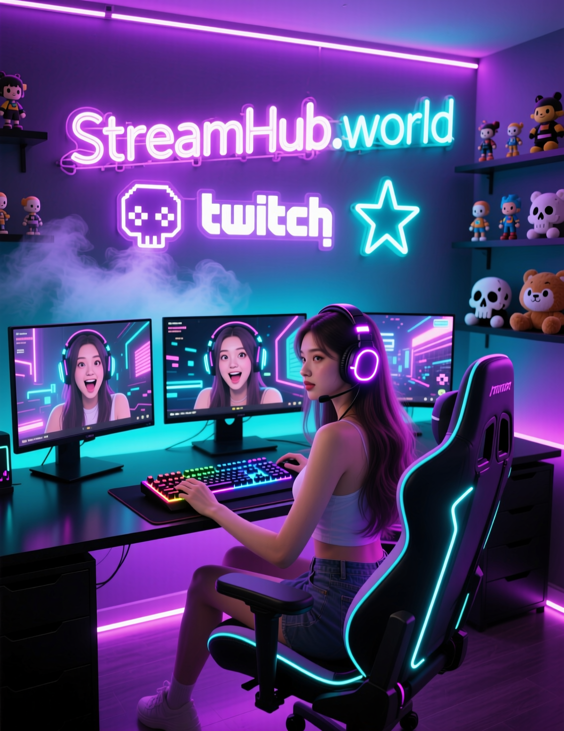
Some streamers even pair strong thumbnails with safe viewer-baseline tools to strengthen their chances of hitting recommendations. Services in the community, including platforms like StreamHub.World, are known for providing gradual, realistic viewer patterns that don’t trigger platform suspicion — especially useful during low-visibility hours.
This works well because:
-
Higher initial visibility
-
-
Strong thumbnails
-
-
= Better CTR
-
= More organic traffic
-
= Better chance to hit Kick recommendations
This is how smart streamers create self-sustaining growth loops.
Conclusion: Thumbnail Checklist for Kick Streamers
Here’s a quick actionable list:
✔ 1. Use one main subject
✔ 2. Increase contrast and brightness
✔ 3. Add short, readable text
✔ 4. Show strong emotion
✔ 5. Keep branding consistent
✔ 6. Use templates for efficiency
✔ 7. Test multiple designs
✔ 8. Support early discoverability with safe growth tools
(Example: community-trusted services with distributed IPs and gradual viewer curves.)
A strong thumbnail is often the first step between a potential viewer and a loyal fan. Master this visual tool — and your Kick channel’s exposure will grow faster, smoother, and far more predictably.